The Past and Future Keeling Curve
With all the present-tense climate f&%kery going on in the world, it’s easy to lose track of the fact that it’s CO₂ that’s primarily driving these events (with methane in second place for now). Okay, for the purists, it’s overshoot that’s causing the f&%kery. But we’re going to stick to CO₂ for the purpose of this article. Meanwhile, as civilization crashes and burns, as our fellow humans murder each other over who believes in which invisible friend, as Net-Zero pledges are made and broken, it’s physics that’s telling us the bottom line reality: 1.5°C will be effectively shattered by the end of this year.
Ah, but there’s still “hope.” The latest data shows that real progress is apparently being made on the rate of growth of CO₂.
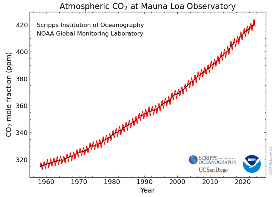
That last sentence requires some explanation. CO₂ itself continues to rise. The latest data from NOAA shows September, 2023 CO₂ at 418.51 parts per million (ppm), up 2.60 ppm from a year ago. There’s no question that CO₂ is going to blast through 430 ppm and 440 ppm over the next ten years. And the most up-to-date Keeling curve does not appear to show any progress at all:
In this post I want to dig deeper into the NOAA data and explore what it predicts about the timing of Net-Zero and the future of the Keeling curve. I’m going to focus here on the rate of growth of CO₂, not on the quantitative amount of CO₂ in the atmosphere. The rate of growth is what Net-Zero is all about. When will the pure, raw, physical amount of CO₂ in the atmosphere stop growing?
A small caveat. Net-Zero is not actually about getting to Zero growth in CO₂. It’s about getting to “implied zero growth” — planting a tree today that will offset some amount of CO₂ over the future lifespan of that tree. That kind of thing. Here is the Wikipedia definition:
Global net zero emissions, or simply net zero, is a state in which human-caused emissions are balanced by human-caused carbon dioxide removals over a specified time period. In some contexts, “emissions” refers to emissions of all greenhouse gases, and in other contexts it refers only to emissions of carbon dioxide.
Net-Zero is a lame metric. What I’m discussing here is simply “Zero.” When will the amount of atmospheric CO₂ stop growing?
Okay, back to the main topic. As mentioned above, the last 12 months showed a growth in CO₂ of 2.60 ppm. But ENSO cycles, sun cycles, volcanic eruptions, economic crashes, global industrial shutdowns and other things can greatly impact the rate of CO₂ growth. Twelve months is too short a period to get a good sense of where things are going. For that reason, I am going to focus on the 36-month running mean of the Keeling curve. That is, each month’s CO₂ will be that month’s current reading averaged with the preceding 35 months. I will use this 36-month running mean to compute the growth of CO₂.
[Math moment. For those who like calculus, I am taking the “time derivative” of the 36-month running mean of the Keeling curve.]
So, for example, in September, 2020, the 36-month running mean for CO₂ was at 410.90 ppm. The 36-month running mean for CO₂ for September, 2023, was 418.06 ppm. Together, this shows a “36-month mean rate of growth” of 7.16 ppm over the last 3 years.
Here is a graph of the 36-month mean rate of atmospheric CO₂ growth from March, 1964 to September, 2023:
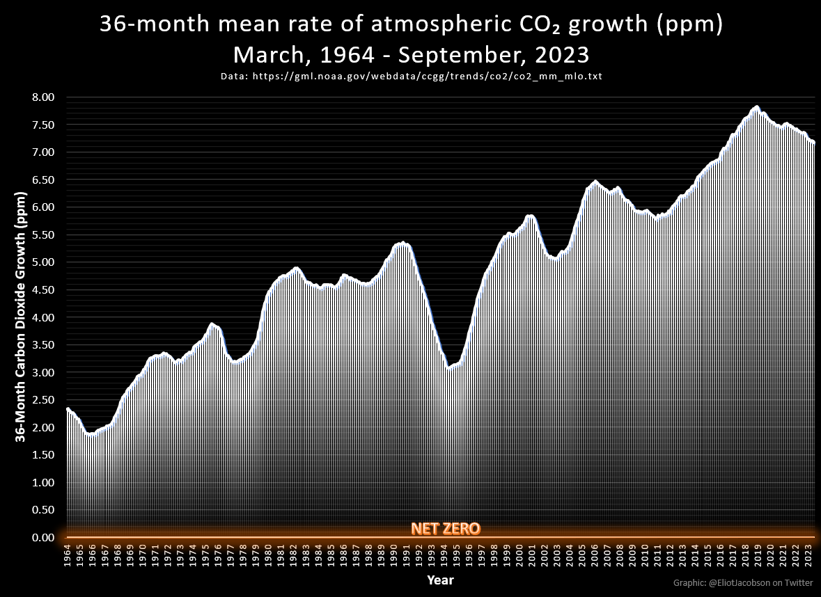
As you may be able to tell from the graph, the maximum rate of growth in CO₂ happened in February, 2019. The 36-month period from February, 2016 to February, 2019 saw a gain of 7.83 ppm. It’s been mostly downhill ever since.
As an aside, many people notice that huge dip in the early/mid 1990’s. That was the aftermath of the Mount Pinatubo eruption. The multi-year impact of this eruption on the rate of increase of CO₂ was staggering. Here is an article on the topic, if you want to read more about it. But things got right back on track after the start of the millennium.
Okay, back to the graph above. The rate of growth of CO₂ has been declining steadily since 2019. That’s a fact. A hopium-soaked optimist might look at that decline and say that we’re making progress towards Net-Zero. They might say that wind, solar, EVs and every other green energy source are doing their thing. They might even block me on Twitter for disagreeing. Nevertheless, let’s assume the optimist is 100% right and look at the implications for the future.
Here is the same graph, with a linear interpolation showing the future growth of CO₂ assuming these declines continue at their current rate:
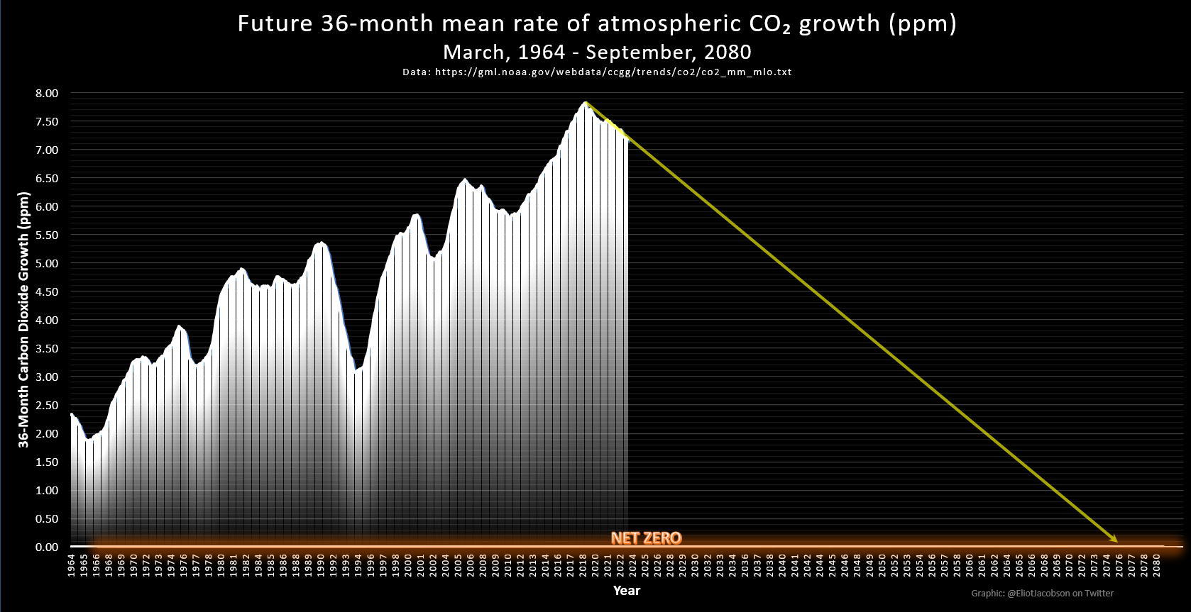
This graph even shows when Net-Zero will be reached. If you squint, you will see it. At the current rate of decline in the growth of CO₂, we should see Net-Zero sometime in mid-October, 2076. That’s 53 years from now.
From this extrapolation we can use a little mathematical trickery and work backwards to predict the future of the Keeling curve. And so, I offer you the “Past-and-Future Keeling Curve”:
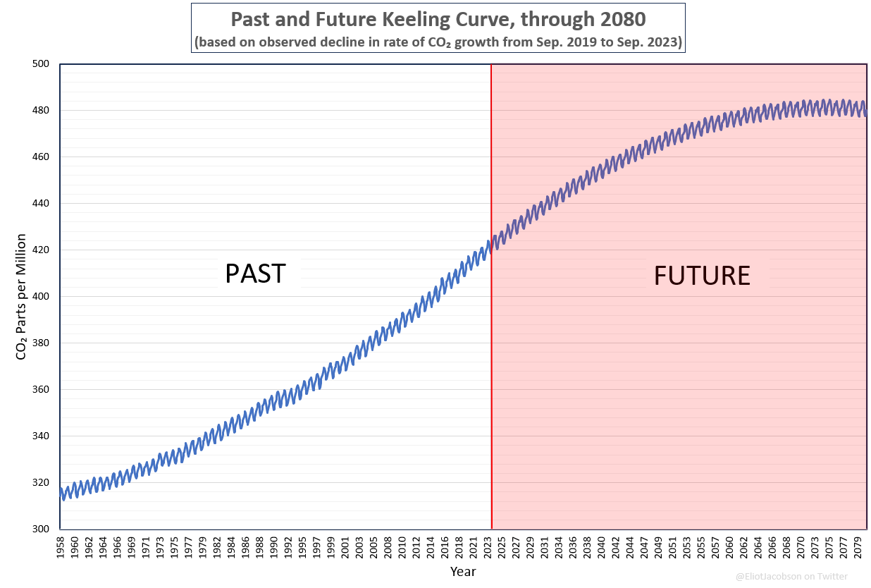
In particular, we now have a prediction for the future maximum CO₂. That maximum? 484.60 ppm, happening in April, 2075.
Of course, none of this is going to happen. Long before much of this comes to pass, global industrial civilization will have collapsed and billions of humans will likely have perished under the weight of our collective planetary f&%kery. The climate casino’s over/under is for the maximum to be reached sometime in the 2040’s at about 450 ppm.
Good to know humanity got its act together a solid 50 years after we knew it was a problem, and far after we could reasonably stop it.
Sweet.
The last graph looks so much like the graph of world population growth, which is not much of a surprise.
Eliot, I very much appreciate your work and devotion to the “Doomer” cause, to save humanity and the biosphere. I should like to add my 2 cents worth: the negative health consequences of human overpopulation driving overconsumption and pollution (including CO2), and the contribution of water vapor as a GHG- the product of ocean heating and glacial ice melting. It is the latter aspect of global heating that worries this old physician and offshore sailor the most. We are burning 8 BILLION TONS of coal in 2021(latest figure) and 100 MILLION BARRELS of oil DAILY. Global ice is melting at a rate of 3.5 BILLION TONS a DAY, while absorbing 1.08 X 10 to the 17th BTUs PER DAY. The geophysicists I read on the net predict a total melting in 77-110 yrs. DW says by 2,100. Then what? Venus 2.0 when our natural AC is eliminated by our incessant global heating? I am, also, the author of the free online e-book PDF, “Stress R Us”, which elaborates “population density stress” as the chief, if not sole, cause of ALL human diseases. 60% of American adults already suffer from at least one serious chronic health problem, and we took 4.3 Billion prescription medications in 2021 in order to survive. I believe that you, with your mathematical mind and sharp curiosity, let alone devotion to humanity and the biosphere, would find “Stress R Us” most interesting, along with your continued focus on CO2. Thank you, again, for your fine work!
interesting
I truly do not understand the climate activists who are so confident that we will reach zero (net or otherwise) by 2040 or so, and then everything will stabilize and we can pick up where we left off. Yeah, the Keeling curve offers hope (or hopism, I guess). But even it assumes that all sources of GHGs are human controlled and UNDER human control. Case in point: this year’s Canadian wildlifes. Oh, we caused ’em all right. But not only do we not control them (and can’t seem to get them under control), but they are generating GHGs equivalent to the world’s 4th largest emitter. Are those accounted for in the Keeling Curve and other tools for measuring and predicting GHG levels?
So feedback loops and irreversible processes are going to continue to generate GHGs and otherwise fuck up the planet, even if/when that miraculous day arrives where they can declare, “We have achieved net zero!”
Thanks, makes 100% sense. This sentence : “Of course, none of this is going to happen. Long before much of this comes to pass, global industrial civilization will have collapsed and billions of humans will likely have perished under the weight of our collective planetary f&%kery “
Bingo
Thank you so much for your work mr Jacobson. You are continuing in a great tradition Of nineteenth and twentieth century visionaries. I became a doomer back in the 1970 after reading Paul Ehrlich and the club of Rome report. The only mistake I made was that the unraveling has taken much longer than I had anticipated. I’ve reached an age where I am close enough to the goalposts of life That acceptance Comes easily to me. My greatest sorrow is to Have seen so much destruction of the natural world accompany The collapse of our s*** show civilization. Keep up the great work!
Eliot:
Glad to see you back. There are times when I fear we have lost you.
It might be interesting to show the Keeling curve on the same page (piece of paper) as your 36mo. mean.
Discerning eyes can then correlate the seemingly insignificant little Keeling “steps” with the chasms in the mean.
The “step” at 1994 is the easiest to see.
Bill
Very good work as always, Dr. Jacobson. It is appreciated.