April 8 quote by Naomi Klein does it for me. .. bit by bit, hour by hour, day by day,…
The Methane Monster Cometh
 The two greenhouse gasses (GHG) that are the primary drivers of climate change are carbon dioxide (CO2) and methane (CH4). This post is about Methane, which is 84 times as powerful a GHG as CO2. If you are interested in CO2, I refer you to this page on NOAA’s website which does a great job explaining the growth of CO2 in the atmosphere since 1958, when data collection at Mauna Loa began.
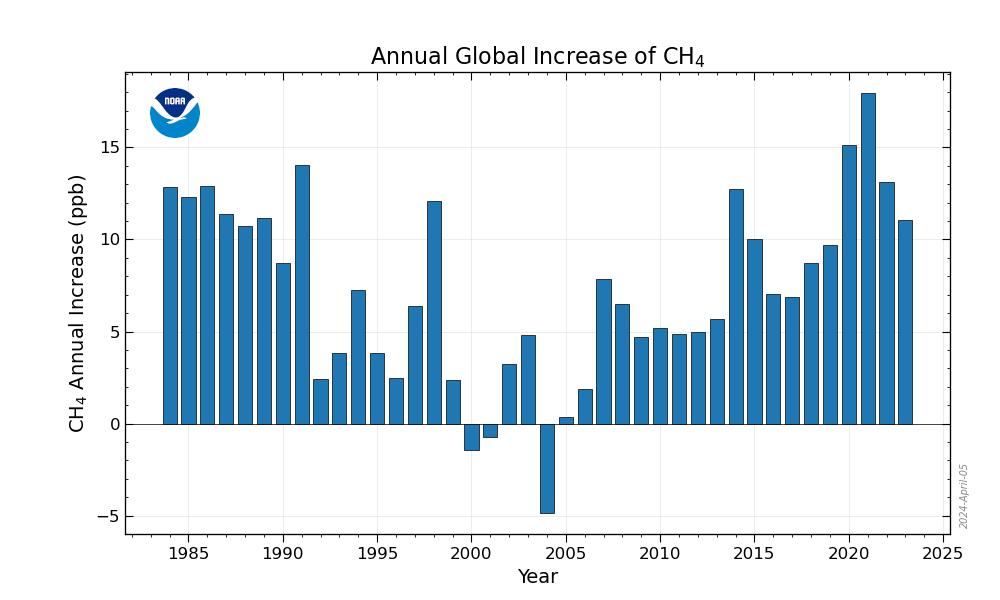
Now, going to the same NOAA website and looking for data on CH4 we first discover that “global methane” has only been recorded since 1983. We then find this chart, giving year-over-year net increases/decreases in CH4, with the following explanation:
 “The annual increase in atmospheric CH4 in a given year is the increase in its abundance (mole fraction) from January 1 in that year to January 1 of the next year, after the seasonal cycle has been removed (as shown by the black lines in the figure above). It represents the sum of all CH4 added to, and removed from, the atmosphere during the year by human activities and natural processes. ”
One thing to note is that this chart does not tell you how much methane went into the atmosphere, only how the methane level changed. I have no issue with this methodology, and it is clear that the long term trend is that methane concentrations are increasing far too fast. But I decided to look closer and see if I could get a more refined month-to-month view of the actual amount of methane going into our atmosphere, similar to what is presented for CO2.
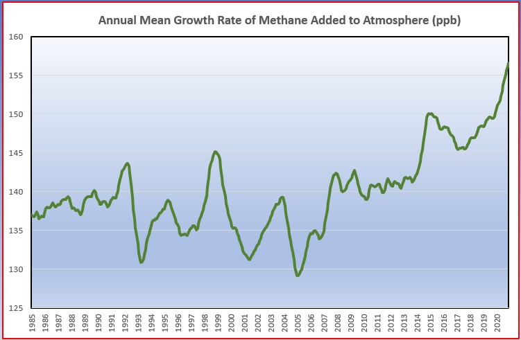
Before I tell you how I did it, here is what I got:

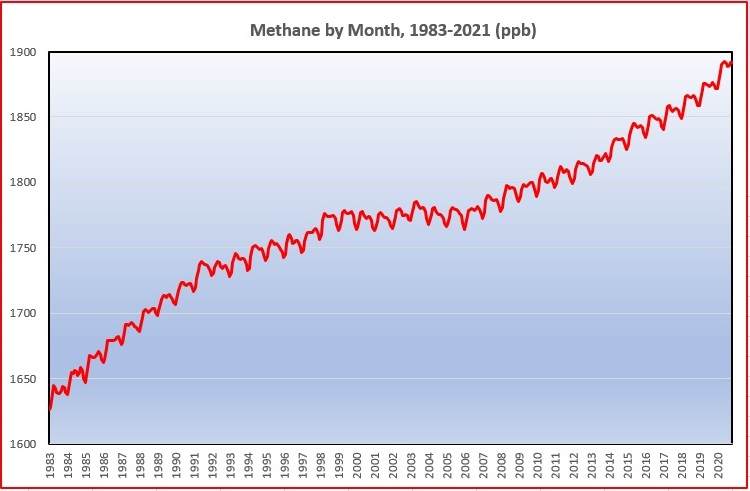
For context, here is the graph of atmospheric methane in parts per billion (ppb) during the entire period CH4 data has been recorded:

Hopefully these plots will give you the same “holy fuck” experience that I had when I looked at them. Methane is accelerating at an alarming rate. The source of this acceleration is not widely understood, though there are many competing hypotheses at this time. Foremost among the scariest of these possibilities is that methane clathrates from the Arctic and Siberian methane from the melting of the permafrost are now entering the atmosphere in substantial amounts.
Methodology
I first grabbed the CH4 data from NOAA here, it is current through May, 2021. There is something called “reanalysis” that delays these values by approximately 4 months. It’s frustrating to get May’s value in September, but that’s how it goes with methane.
Onto the analysis. First, the IPCC in AR5 stated that atmospheric methane has a half-life of 9.1 years. That means that half of all methane in the atmosphere at any given moment will cease to exist roughly every 110 months. There is a simple equation that describes, given how much methane we have at any initial moment, how much will persist after any specified amount of time has passed. This is called “exponential decay” and is one of the simplest math ideas students learn in their first year of undergraduate calculus.
To put it super-simply, if you know the amount of CH4 in a given month, call it “old methane”, then the amount of that CH4 that will still be present the following month is approximately given by:

For simplicity, that weird term (1/2) to the power (1/110) is equal to about 0.993718. Each month we have about 99.3718% of the methane from the previous month left over. Keep that in mind.
Next, like NOAA, I wanted to smooth things out. So instead of looking at month over month rises and falls, I used the trailing 12 months and averaged those. I didn’t just look at January 1 – December 31. Rather, to get smoothed values, I used the average over the previous 12 months as the amount of methane in the atmosphere for that particular month. In finance, this is called TTM, or “trailing twelve months.” Because any 12 month period covers all atmospheric conditions that naturally alter methane concentrations, I couldn’t see a problem with this approach. However, this forced me to start my plot in 1984, since I needed 12 months backlog to start the smoothing process.
Next, for any given month, I took the TTM average from the previous month, multiplied it by 0.993718 to get the left over methane. Then I looked at the TTM for the current month’s methane and compared it to the left over methane from the previous month. The difference is how much methane was added to the atmosphere in the current month.
So, each month I could easily compute how much methane was added. But again, these monthly numbers weren’t the story I was looking for. Like the NOAA graph above, I wanted to get an idea of the yearly CH4 being added to the atmosphere, but refined to a monthly data point. So, once again I used the TTM idea and simply added the previous 12 months of methane being added to the atmosphere together to get the yearly amount over the previous 12 months. This cost me another 12 months in the data, so my analysis now starts in 1985. But, in this fashion, on any given month I could say how much new CH4 was added to the atmosphere over the previous 12 months.
Conclusion
One thing is for sure, even though atmospheric methane is short-lived, if huge and ever-increasing amounts of methane continue to make it into our atmosphere, what ever planning we were doing for offsetting and mitigating CO2 emissions is going to become irrelevant — we are going to boil.
Oh, and a disclaimer. I am not an atmospheric scientist. I am not at all sure this methodology is sound. But it seems okay to me. If you are an atmospheric scientist and want to drop me a note, please! I am eager to hear from you.
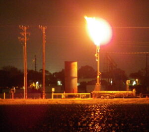
Thank you to haymarketrebel on flickr for making this picture available.
– link deleted –
Site by an actual climate scientist telling people why we are, in fact, not fucked